It seems simple: promote a product or service, create your landing page, sit back and start counting lots of money. I wish it were that easy! Unfortunately, with millions of websites competing for attention, Affiliate Marketing is far from easy, but it’s also not impossible. The key feature of the Affiliate Marketing landscape is the landing page, that gateway that introduces visitors to your online store and/or affiliate link.
Landing Page Introduction
A landing page is the web page your visitors arrive at after clicking on an online advertisement, email link, or affiliate link. The landing page is an extension of these ads and is specifically designed to attract attention, generate interest, spark desire, and persuade the visitor to take the desired action.
How can you tell the difference between a good landing page and an excellent one?” The answer is simple: a good landing page is well designed, professional, and easy to read; but an excellent landing page makes you buy. The landing pages that lead to the payment process are considered excellent landing pages.
Landing Page Function
The function of your landing page is simple: convert an online visitor into a customer or client by persuading them to complete a specific transaction. This persuasion often encourages the visitor to buy a product or service, but not always. Landing pages can persuade visitors to learn more about a topic, they can take visitors to a content page.
Persuading a visitor to complete a transaction on your landing page may not seem that difficult, however, it is. The following are just a few samples of what you will face:
- Most visitors don’t like to read a lot of text. Brevity and precision are absolutely necessary.
- Most visitors hate revealing contact information. This resistance to revealing email addresses and phone numbers will make it difficult to follow up with a potential customer.
- Most people don’t take the time to fill out information on screen, including forms, surveys, etc. This makes it difficult to track any client.
- Many people are very concerned about using their credit cards online. They need to feel completely safe before they even consider doing it.
- Visitors choose from one billion websites. How do you get them to stay with you, even for a few seconds?
The list is almost endless. These factors make landing page conversions (that moment when a visitor becomes a customer) difficult, but successful landing pages take those factors into account and address all of these concerns.
Common Myths in Online Marketing
Understanding what online marketing is, can be easier if you know some common myths about it. Below we present some misconceptions.
Create a Great Website or Landing Page and Visitors will Come
The truth is, it is possible to spend thousands of dollars and countless hours beautifying your site and fine-tuning your landing page, all in vain. Keep in mind that millions of well-designed websites and landing pages are completely ineffective when it comes to converting visitors into customers. Nothing is passive in online marketing; It does not involve simply setting up a site and waiting for customers. Successful online marketing involves a calculated, intelligent and creative marketing strategy.
More Visitors to your Website Translate into More Sales
This myth is 70 percent correct. The absolute truth is that attracting more qualified visitors to your site translates into more sales. SEO marketing can bring tons of visitors to a website’s home page, but those people aren’t always the type of visitors you can then convert into customers. However, PPC and affiliate marketing can isolate and target a very specific clientele.
When it comes to creating successful landing pages, one of the tricks is to launch advertising campaigns designed to attract qualified visitors: visitors who are specifically searching for what your landing page has to offer. We know clients who attract thousands of visits per month to their websites and yet see virtually no conversions. This is a classic example of ineffective acquisition efforts, where acquiring all the visitors in the world means nothing if none of those visitors take the leap to become a customer.
The More Content There Is on a Website, the Better
Content is very important on a landing page. However, brevity is usually the key. You can easily locate a landing page full of text that no one takes the time to read. Some landing page developers think it’s a great idea to share how brilliant or well-read they are, or insist that the more information you can include on a site, the better. Is not true. As a web surfer, you read titles, devour short sentences, and love white space on a page. In other words, you are a scanner and it makes sense to develop landing pages with that in mind.
Offering a Wide range of Products/Services on a Landing Page results in More Sales
When developing a landing page, you are always tempted to include a few more products on the page in hopes of increasing your chances of selling something. One warning: filling pages to the gills usually doesn’t work. Too many options can confuse the visitor and cause them to leave. Generally, a landing page works best when a focused ad or search brings visitors to a focused site.
To see why landing pages dedicated to specific products work, look no further than the purchasing process itself. When developing your acquisition campaign, you try to attract the attention of qualified visitors, that is, those looking to buy. The more general your site is; the more visitors tend to browse rather than purchase.
The Right Product/Service will Make Me Rich
We’ve all seen landing pages selling products we never imagined they would sell in a million years. On the other hand, we have seen exceptional products that have difficulty selling. The fact is that good products or services don’t always sell, and sometimes inferior ones do.
If you discover a product that isn’t necessarily strong or selling well, take the time to study the associated landing page. What type of language is on the page? What attracts you to the site? You need to study the landing pages that sell products successfully; Those who successfully sell mediocre products and services need to be studied twice as much because they must clearly be doing something right. Imagine what you can do with a good product and a great landing page.
You will surely come across many other myths and misconceptions that arise from online marketing. Our list here is by no means an exhaustive list, but we wanted to mention the main ones so you have a better idea of what true online marketing is all about.
Understand the Customer Lifecycle
An integral part of landing page optimization is understanding your customer lifecycle. The customer lifecycle refers to the relationship an online customer develops with you and your company. This relationship may last several years or may be a one-time visit to your website. The purpose of the customer lifecycle is to identify the key stages in a customer’s engagement with your company. These stages are
- Acquisition: Getting visitors to your site.
- Conversion: Getting visitors to take a desired action on the site, such as a sale.
- Retention: Keep the customer coming back for future business.
Each stage is based on the following: there can be no conversion without acquisition and there can be no retention without conversion. These three elements of the customer lifecycle form the framework from which a successful landing page is designed.
If there’s a secret to landing page optimization, it lies in understanding the relationship between acquisition, conversion, and retention. Each of these three elements requires a separate set of skills and strategies to be effective. Those who are willing to take the time and energy to master each of these elements can create a successful, revenue-generating landing page.
Acquisition
The phrase build it and the visitors will come does not in any way apply to online sales and landing page success. Getting visitors to your landing page is a strategic, carefully thought-out operation. Acquisition refers to the strategies you use as part of that operation, all with the goal of attracting visitors to your landing page. Procurement is hard work that requires a combination of organizational skills, dedication and creativity. You can choose from many acquisition strategies (some are more effective than others), but if you combine them, these strategies will be the foundation of your landing pages’ success.
When it comes to landing pages, nothing is as important as acquisition. If you don’t have visitors, you don’t have clients. In fact, the acquisition is so significant that it has inspired an entirely new industry. Consultants and procurement specialists have emerged offering their services to organizations seeking to increase the effectiveness of their online sales. These specialists are not cheap; That cost reflects the importance that companies place on acquisitions.
We’re sure you’d rather not have to pay thousands of dollars to procurement specialists, and fortunately, you don’t have to. These specialists took the time to understand how procurement works and spent many hours adjusting and perfecting their procurement strategies. You can do the same.
Conversion
Acquisition involves attracting visitors to your landing page, a fairly simple concept and yet very difficult to pull off effectively. A conversion occurs when a visitor takes a desired action. This can be signing a form, purchasing a product, or registering on the site. A conversion, basically, is a visitor doing what you want them to do.
In any landing page documentation you may end up stumbling upon, perhaps the most commonly used term is conversion rates. The conversion rate your landing page achieves refers to how many visitors take the desired action, compared to those who leave without taking it. This is expressed as a conversion rate versus a bounce rate – the rate at which people come to your site and then immediately leave.
The goal of landing page optimization is to increase conversion rates, a goal that is not always easy to achieve. When it comes to increasing conversion rates, there is a lot to do, including a lot of research, testing, and re-testing.
Retention
Retention is the third key element of a successful landing page campaign, right after acquisition and conversion. Retention involves maintaining the relationship you have established with your customer. After all, it’s easier to get a repeat customer than it is to try to find new ones.
You have several strategies available when it comes to retaining customers. (Perhaps it goes without saying that the first of these is to provide a quality product/service). Your retention strategy begins as soon as your visitor becomes a customer. Two key retention methods that have been particularly effective are email and newsletters.
Managing your Expectations
Many people, when starting out with online marketing and developing their landing pages, come to the plate with misinformed expectations. This can lead to unrealistic sales projections and ultimately dissatisfaction with your online campaign. Setting realistic expectations is one of the keys to achieving success online. Some products work naturally better than others. Some landing pages take time to have a voice that works for the reader to take action. It takes time (and doing things in moderation) to make a landing page successful.
The Myth of High Conversion Rates
Many people claim to know the secret to high conversion rates and are willing to sell you those secrets. The truth is, there is no such thing as a 100 percent conversion rate. Our advice to you: forget about unrealistically high conversion rates. Aiming for that 100 percent can be frustrating and cause you to have to adjust a landing page that’s actually performing quite adequately.
So what is a good conversion rate? This is a difficult question to answer. The truth is that it all depends on many factors: the type of product, the economy, the cost of the product, the marketing campaign, and more. So when we talk to clients about conversion rates, we talk in very general terms because there will always be exceptions. Generally, you can expect conversion rates to be between 0.5 percent on the low end and 10 percent on the high end. On average, you’re likely to encounter conversion rates between 2 and 3 percent.
In very simple terms, this means that for every 100 visitors to your site, 2 or 3 of them should end up purchasing something, which is why acquisition becomes so important. The more focused visitors you can attract to your site, the better your chances of securing these conversion rates.
There is no failure on landing pages, there are only lessons to be learned. With proper tracking and record-keeping, every setback brings you closer to creating landing pages that get the best results for your product.
Understanding Different Types of Visitors
To help create realistic expectations, you need to understand the types of visitors you will have. We have identified four types of visitors: No, Yes, Probably Not and Maybe. With the visitor No, no matter how well designed the landing page is, you will not convert. A targeted acquisition campaign should eliminate most of the no’s, but these slip through the cracks. You don’t really need to focus much on visitor No.
On the other end of the spectrum is the Yes visitor. They have a credit card in their hand and will buy even from a poor landing page. These are the people who search for a specific product, see your relevant ad, click on the landing page, and make a sale without much convincing. This is usually not a large group, but a focused acquisition campaign can find these types of visitors so you get an easy conversion.
Converting Probably Not and Maybe Visitors
Between automatic No visitors and easy Yes visitors there are two other groups. These are the Probably Not and Maybe visitors. You can increase your conversion rates and target your campaigns by skillfully targeting these two groups. Visitors who probably don’t are looking for any reason not to buy: bad writing on the landing page, complicated checkout system, confusing design, you name it. They have their cursor on the back button ready to exit their landing page.
This scary group can be converted with a well-designed landing page, but it will take some effort. One of the tricks to attracting these slippery visitors is to review your landing page through the eyes of the visitor who probably won’t. Take the time to analyze your site and look for any reason to close it. If you’re honest, you’ll find areas that don’t work for the visitor. Probably not. In truth, most of us are, deep down, probably not the type of visitors.
Visitors to Maybe are a little more forgiving than those to Probably Not. They spend less time looking for a reason to leave and more time identifying if the product/service is what they need. They are usually less concerned with form and format than with the end result. Of course, a poorly designed site will also lose them, although not as quickly. They’re looking to buy and your landing page just has to get them to the top.
Key Landing Page Elements
To create an effective landing page, you must have relevant and important information for the visitor organized and available. The information presented is the key to knowing if the visitor stays or leaves. To make sure he or she stays, include the following items:
The Header
The header is the sentence at the top of the page that the visitor usually sees first. The purpose of the title is to attract the visitor’s attention and encourage them to continue reading. As you might expect, the title is an integral element because almost everyone reads the title and it has to grab their attention. Sometimes first time writers try to pack too much into their headings, which become complete paragraphs of information. People want quick, concise information.
A Value or Proposition Statement
The value statement or proposition is a concise, clear sentence that indicates the expected results your visitor will get from using your product or service. Developing a clear value statement is the first step in establishing why a visitor should buy from you. The more specific statement you can make, the better.
Body Text
The body copy is the largest part of your landing page and includes the listed benefits your visitors will receive from your product or service. Readers will not necessarily read the body of the text, or at least not all of it, most do not read everything they encounter and tend to filter the content quickly. This reality is why you need to structure the body of the text so that the reader can easily and quickly find what they are looking for.
The writing of the body should be done in small fragments or paragraphs, which makes it easier to read. Keep your paragraphs relatively short with a maximum of 3 to 4 lines, using short, easy-to-read, clear, concise and powerful sentences. Whenever possible, use a quick bullet list to highlight important values and benefits. Use bold and italics to draw attention to really important parts of the text. The length of the body text must be concise and brief.
A Call to Action
Just as it sounds, a call to action is an action, often in the form of a statement or a page button to click, that you tell your visitors to do. Be bold. Tell your visitors exactly what you want them to do. The call to action is the text that is used to try to get the visitor to take an immediate action, such as Click Here Now!, or Limited Time Only!.
To get a better idea of what a call to action is, think about a late-night infomercial where you’re repeatedly asked to have your check or credit card handy. It instills a sense of urgency in you because you will get that big gift only if you call the toll-free number in the next few minutes. This infomercial format really works. We know that advertorials are not everyone’s cup of tea, but the truth is that they work, which is why we emphasize that you should include a version of this type of call to action on your landing page.
Keeping it Simple
A call to action is most effective when it is not too complicated and does not have too many options. You want your visitor to take a single action, such as Buy or Register, and not have multiple options, such as Visit our new website or Call to request our catalog. To be most effective, keep your message focused on a single action.
Here are some things to keep in mind when analyzing your call to action:
- Be specific: Tell your visitors you want them to click, buy, or sign up. Remember to use action words to generate enthusiasm.
- Give a reason: Tell your visitors why it’s in their best interest to take the action you’re requesting, such as Click Now to Save Money !
- Provide a Sense of Urgency: The goal of many landing pages is to generate an immediate sale, so a call to action often includes a sense of urgency.
A good call to action reflects what you want the visitor to do. If you want the visitor to make a purchase, tell them to buy! A call to action can be as simple as Buy Now or as complex as a step-by-step process.
Testing different titles is a good idea and so is creating several calls to action to find out which one is the most effective. You hear different calls to action every day on the radio, television and, of course, on the Internet. Some are more effective than others in encouraging action.
Examples of Call to Action:
- Click here to sleep through the night in just 4 hours.
- Sign up now to receive free tips for preparing your own taxes.
- Buy a season pass and never wait in line again!
- Click here to save now!
Calls to action are designed to move people to act. Choose your language accordingly.
Navigation
Navigation: It is important to highlight that destination pages must not have menus to avoid distraction of the visitor. Preferably, the visitor can only click on the call to action (CTA) button and/or the pages dedicated to contact information, privacy policies, terms and conditions, and disclaimers required by law.
Images Use
Images are a great addition to landing pages. The right image can convey a feeling of professionalism and confidence to the visitor, as well as provide additional information about you and your product. As they say, a picture is worth a thousand words and, like anything else, images can attract and retain visitors or repel them. You know so well that images can have powerful connotations.
The quality and type of image used in the fold is related to the trust that the visitor feels towards the company. Poorly chosen images (or of questionable quality) reduce the visitor’s impression and show that the company does not care how its product is represented.
Use Animated Images and Videos
Many landing page developers choose to include videos or animated images on their landing pages to help convey their message. While videos and animated images can be effective, they can also slow down page load times and create a visual distraction. Even with these caveats, they can be a great asset to a landing page.
When using these items, make sure they really add the sales value you expect as this means longer loading time, longer design time and more expensive. It also creates a distraction, before you even think about using animated images or videos, remember that your main goal is to provide the customer with a rewarding user experience. Will that eye-catching animation or video help your customer decide whether to buy from you? Do they build trust or simply distract from the message?
Don’t get caught up in the flash and excitement just because the technology is there to do it. Your goal here is to get the conversion, not to impress with the flash. If animated images or videos work for your product, go ahead and use them. If they don’t work, feel free to delete them.
Image Location
These are the three main image placements when using images on a landing page:
- On the left
- Centered
- On the right
As with the title, when an image is placed on the left, it is given more importance simply because the eye tends to gravitate to the left when first viewing a landing page. If you decide to place an image on the left, make sure you have chosen a powerful image, one that can sell the visitor on its own.
A less common tactic is to place the image in the center of the landing page. This places the image front and center, reducing the area for text but increasing the importance of the image. When you place an image center stage, make sure it conveys your message clearly.
When placing an image, test to see what works. The only way to really know is to test and retest your site. A great way to test is to use split testing. With split testing, you create two or more sites, put them online, and test them live to see which one performs best.
Writing the Three Key Landing Page Components
Writing the body of your landing page is usually not difficult. The body highlights your product, your company, your service or any information you want to reveal. However, in addition to the body of your copy, you have three key elements within your landing page that you will really need to define in terms of writing quality: title, call to action, and value statement. We highly recommend that you take the time to write them carefully and thoughtfully because they can have a significant impact on your conversions.
Write Attractive Titles
One of the keys to a successful landing page is the title. In a few seconds, you attract or repel your visitors. If you don’t take the time to figure out how to write great titles, the conversion job will be much more difficult.
The header is the first text that visitors see when they arrive at your landing page, making it the key to capturing the visitor’s attention and prompting them to continue reading. In fact, the title is probably the only thing many of your visitors will ever read. This makes the header one of the most important components of your entire landing page.
When it’s time to sit down and write the perfect headline, the first thing you need to do is identify your audience. Your header text should target your demographic. Knowing your audience is what allows you to determine the appropriate language and strategies to use when trying to engage with them.
Here are some tips and tricks for titles:
Use Words in your Title that Immediately Speak to your Demographic
This creates instant appeal directly to your audience.
- Great news for back pain sufferers
- Attention hunters
- Free for dog lovers
Notice in these examples that your audience is immediately identifiable. Chances are, if I suffer from back pain and see the title “Good News for Back Pain Sufferers,” I will be interested.
State the Benefit to your Audience
The landing page is not for your benefit, it is for the benefit of your visitors. Saying it from the beginning is very attractive.
- We’ll save you $500 a year in taxes, guaranteed
- End indigestion now
- Get relief from ingrown toenails
Make your Title Sound like the Best Option, an Innovative Product
Do you have a better mousetrap? Best fitting shoes? People love to discover something new, so give it to them in the title. Use words like new, latest, innovative, revolutionary, or updated.
- Innovative remedy for hair loss
- Get the latest music now
- New development in hair care
Use Questions in the Title
Questions can identify the audience and can be used to engage.
- Do you suffer from amnesia?
- Do you want to know the secret of success?
- Do you want to know the secret of a great marriage?
Use Instruction Headings
How-to headings are often very effective. If you sell a how-to type product, such as how to build a flat-bottom boat, the how-to header is a great option.
- How to travel to Europe for less than $400
- How to cook a great steak
- How to discover your inner child
Use Number List Headers
Lists of numbers are great because they allow you to use bullet points to make your points, and people love top ten lists.
- Five ways to relieve back pain
- Fifty ideas for Valentine’s Day
- Seven secrets to success
Issue a Command with the Title
The command basically gives a command and is very direct in what it asks the visitor to do.
- Buy now and save
- Do not lose this chance
- Enroll in our program today
Include an Offer in your Header
Face it, visitors come to your site to find something. Make them an offer in advance and save them from having to read further.
- 75% discount on women’s shoes
- Buy one knife and get a second one free
- Get free trial software when you purchase our book
Finding the right direction can be a big task. You can test titles with various campaigns or have your friends read them.
Many people try to get attention by using capital letters in the title. MAKES THE TITLE DIFFICULT TO READ. Instead, the main title looks better with mixed capital letters: it makes the title easier to read.
Many people try to put humor on their landing pages. This can be very complicated and, for the most part, the risk does not justify the reward. The reason is simple: humor is not universal; What’s funny to you may not be funny to someone else. In fact, it can be offensive.
Write Calls to Action
In advertising, the call to action is the text that asks the visitor to take a specific action. You may be using the call to action to ask the visitor for an email address, complete a survey, purchase a product, or complete any other task you want.
The call to action is important because it gives your visitors clear direction on what you want them to do. You need to give your visitors a clear direction because you don’t want them to get lost and click away from your site. A well-written call to action implies urgency, encouraging your visitors to click now and not postpone the desired action. Some examples of a call to action include:
- Sign Up Now
- Click here to Get an e-book for Free
- Download your Copy Here
- Click Now to Get your 30-day Free Trial
- Take a Tour
- Add to Cart
- Register Now
As shown in the list, the call to action is very clear about what you want your visitor to do. Calls to action are not about ambiguity; must be clear, focused and brief.
The call to action can be freestanding text that is linked, but most commonly the call to action is a linked button. The button can have various colors and sizes.
You can easily find call-to-action texts and buttons online, browse the web and find one you like. Find the button color and shape that would complement your landing page and then incorporate it into your design.
Write A Value or Proposition Statement
The value statement is an important part of your landing page; It is a clear statement of how your product/service benefits your visitor. That is, it clearly describes why your visitor needs your product (or service). Again, to write a statement of great value, you definitely need to know your audience. You simply can’t describe the benefits to someone if you don’t know who you’re talking to.
If you search online, most companies have poor and ambiguous value statements. They are too general, don’t speak directly to their audience, and are often more seller-focused than customer-focused. Every day you hear poorly written value statements:
- We offer the best waffle maker on the market.
- We are the specialists in acupuncture.
- We have the largest selection of socks available.
- We have the best accountants working for you.
- We will not be underestimated.
All of these examples are not about the people your visitors care about most, that is, they are not about themselves. These value statements need to change to focus on how they benefit the reader. So, you may be “the acupuncture specialist,” but how does that benefit your visitor?
Highlighting the Potential Benefit for Visitors
Thus, the value statement should clearly identify the outcome for the visitor. The table shows what we mean by modifying titles to highlight the potential benefit to visitors of the advertised product.
Original statement
Customer-Centric Value Statement
Customer benefits
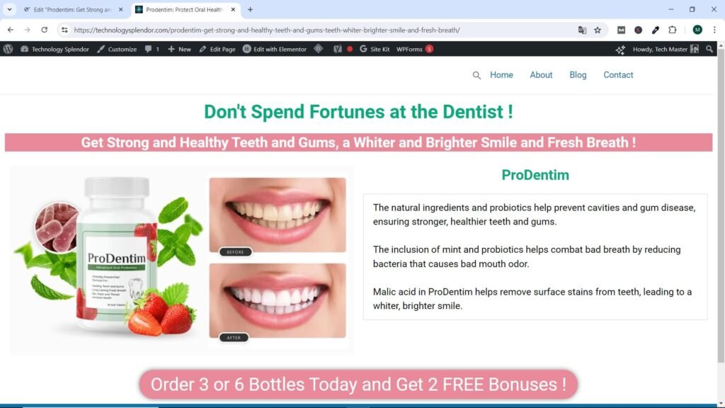
We have the Best Probiotic for your Oral Health
Don’t Spend Fortunes at the Dentist!
Get Strong and Healthy Teeth and Gums, a Whiter and Brighter Smile and Fresh Breath!
We are the Specialists in Computer Assembly.
Don’t Pay High Prices for Brand Name Computers
Learn to Assemble your Own Computer, Easy, Fast and… Free !
As can be seen from the table, it doesn’t take much to divert attention from the salesperson or supplier to the customer. This seems like a simple concept but it is often overlooked. When developing your value statement, take the time to clearly identify the customer benefits of your product. Take the attention away from you and towards them. Change your use of pronouns from we or I to you.
Maximize Your Affiliate Success with Effective Landing Page
When a person who is potentially interested in your affiliate offer finally clicks on your affiliate link, they will of course go somewhere. Your destination will most likely be some type of landing page. The landing page basically convinces them to take the next step: whether it’s getting on a list or making a purchasing decision.
The landing page captures a lead (a potential customer’s name and email address) to send to a merchant’s sales page for a chance to earn great affiliate commissions. Obviously, the landing page is useful for both the affiliate and the merchant as it is where the sale is ultimately made. An affiliate may not necessarily need to create a sales page, as they are more concerned with driving the potential customer to the merchant’s sales page.
A/B Testing on Landing Page
A/B testing, also known as split testing, is a method used to compare two versions of a webpage, landing page, email, or other digital content to determine which one performs better in terms of a specific metric, such as conversion rate, click-through rate, or engagement. Here’s a detailed explanation of what A/B testing involves and how it works:
What is A/B Testing?
- Definition: A/B testing involves creating two versions of a single variable, such as a webpage or email, which are called Version A and Version B. Version A is the control (the original version), and Version B is the variation (the modified version).
- Purpose: The primary goal of A/B testing is to identify which version produces better results based on predefined metrics. This helps in making data-driven decisions to optimize performance and user experience.
How A/B Testing Works
- Identify the Element to Test: Determine which element of your webpage or email you want to test. Common elements include headlines, images, call-to-action buttons, layouts, and colors.
- Create Variations: Develop a variation of the element you are testing. For example, if you are testing a headline, Version A might have the original headline, while Version B has a new headline.
- Split Your Audience: Randomly divide your audience into two groups. One group will see Version A, and the other group will see Version B. This random distribution helps ensure that the test results are not biased.
- Run the Test: Present the two versions to your audience simultaneously. Collect data on how each version performs in terms of the metric you are measuring.
- Analyze Results: Compare the performance of Version A and Version B. Use statistical analysis to determine if the differences in performance are significant and not due to random chance.
- Implement the Winning Version: If one version clearly outperforms the other, implement the winning version as the new standard. If the results are inconclusive, you may need to run further tests.
Key Metrics to Measure in A/B Testing
- Conversion Rate: The percentage of users who complete a desired action, such as making a purchase or signing up for a newsletter.
- Click-Through Rate (CTR): The percentage of users who click on a specific link or call-to-action.
- Bounce Rate: The percentage of visitors who leave a webpage without taking any action.
- Engagement: Metrics such as time spent on the page, number of pages viewed, or interactions with specific elements.
Examples of A/B Testing Scenarios
- Webpage Design: Testing different layouts or design elements to see which version leads to more conversions.
- Email Campaigns: Comparing two subject lines to determine which one has a higher open rate.
- Advertising: Testing different ad creatives or copy to see which generates more clicks or sales.
Tools for A/B Testing
- Google Optimize: A free tool by Google that allows you to run A/B tests on your website.
- Optimizely: A popular platform for A/B testing and experimentation.
- VWO (Visual Website Optimizer): A tool for running A/B tests, multivariate tests, and split URL tests.
- Adobe Target: Part of Adobe Experience Cloud, it offers A/B testing and personalization features.
A/B testing is a powerful technique for optimizing digital content and improving user experience by making informed decisions based on data. It allows marketers, designers, and developers to test hypotheses and understand what changes have the most significant impact on their goals. By continuously testing and iterating, you can achieve better performance and higher conversions over time.
Software to Create a Landing Page
Creating effective landing pages is crucial for capturing leads and driving conversions in affiliate marketing. Here are some of the best software options available for creating landing pages:
Unbounce
- Features: Drag-and-drop builder, A/B testing, AI-powered copywriting, and over 100 templates.
- Pros: Highly customizable, excellent for A/B testing, and strong integrations.
- Cons: Can be expensive for small businesses.
- Website: Unbounce
ClickFunnels
- Features: Comprehensive funnel builder, membership site capabilities, email automation, and a wide range of templates.
- Pros: All-in-one solution for sales funnels, easy to use, and great for beginners.
- Cons: Higher price point and some limitations in customization.
- Website: ClickFunnels
Leadpages
- Features: Drag-and-drop editor, built-in SEO tools, pop-ups, alert bars, and over 150 templates.
- Pros: Affordable, user-friendly, and good for small businesses.
- Cons: Limited A/B testing on lower plans.
- Website: Leadpages
Instapage
- Features: Customizable templates, A/B testing, heatmaps, and personalization.
- Pros: High conversion rates, detailed analytics, and advanced customization.
- Cons: Higher cost compared to other tools.
- Website: Instapage
Gutenberg
- Features: Allows users to create content using blocks, which can be customized and rearranged.
- Pros: Native WordPress editor, no need for additional plugins.
- Cons: Not as feature-rich as dedicated landing page builders. Limited design customization compared to other tools.
GetResponse
- Features: Landing page builder, email marketing, automation, and webinars.
- Pros: Integrated marketing suite, affordable, and user-friendly.
- Cons: Limited customization options.
- Website: GetResponse
Elementor
- Features: Elementor is a visual, drag-and-drop interface for easy design without coding. Access to hundreds of professionally designed templates. Create mobile-friendly landing pages. Create popups to capture leads and boost conversions. Customize your entire site, including headers, footers, and more. Extensive library of widgets and integrations with third-party services.
- Pros: Extensive design options and control over every aspect of the page. Intuitive interface suitable for both beginners and advanced users. Advanced features like animations, custom CSS, and dynamic content. Large user community and extensive documentation.
- Cons: Can slow down your site if not optimized properly. Some advanced features might require time to master. Advanced features and templates are available in the Pro version, which requires a subscription.
- Website: Elementor
HubSpot
- Features: Drag-and-drop editor, built-in CRM, analytics, and SEO tools.
- Pros: Integrates well with other HubSpot tools, excellent support, and detailed analytics.
- Cons: Can be expensive for smaller businesses.
- Website: HubSpot
These tools offer various features and price points, making it easier to find one that fits your specific needs for creating effective landing pages in affiliate marketing.
How to make a Landing Page step by step with Elementor
Creating a landing page with Elementor involves several detailed steps, starting from setting up your WordPress environment to publishing your fully customized page. Here’s a comprehensive guide to help you create a landing page using Elementor:
I: Setting Up WordPress and Elementor
1. Install WordPress:
- If you haven’t already, you need to install WordPress on your hosting server. Most hosting providers offer a one-click WordPress installation process.
2. Install Elementor:
- From your WordPress dashboard, navigate to Plugins > Add New.
- Search for “Elementor” and click Install Now.
- After installation, click Activate to enable the plugin.
3. Install Elementor Pro (Optional):
- For advanced features, you can upgrade to Elementor Pro.
- Purchase Elementor Pro from the Elementor website.
- Download the Elementor Pro plugin file and upload it via Plugins > Add New > Upload Plugin.
- Activate the plugin and enter your license key.
II: Create a New Page
1. Add a New Page:
- Go to Pages > Add New.
- Title your page (e.g., “Landing Page”).
2. Switch to Elementor Canvas:
- From within the WordPress Gutenberg Editor On the right side under Page Attributes, set the template to Elementor Canvas. This provides a blank page without the header and footer, perfect for landing pages. You can do the same from within Elementor without going through the Gutenberg Editor, selecting Settings → Page Layout → Elementor Canvas.
3. Edit with Elementor:
- Click the Edit with Elementor button to open the Elementor editor.
III: Design Your Landing Page
1. Understanding the Interface:
- The Elementor interface is divided into two main sections: the Panel on the left (where you find widgets and settings) and the Canvas on the right (where you design your page).
2. Add a Section:
- Click the + button to add a new section.
- Choose the structure of your section (e.g., one column, two columns, etc.).
3. Add Widgets:
- Drag and drop widgets from the Panel into your section. Common widgets for landing pages include:
- Heading: For titles and headlines.
- Text Editor: For paragraphs and descriptions.
- Image: To add visuals.
- Button: For call-to-action (CTA).
- Form: To capture leads (available in Elementor Pro or some Email Service Provider (ESP).
- Drag and drop widgets from the Panel into your section. Common widgets for landing pages include:
4. Customize Widgets:
- Click on a widget to open its settings in the Panel.
- Customize the content, style, and advanced settings. For example, change the text color, typography, padding, and margins.
IV: Add Key Elements
1. Header Section:
- Add a Heading widget for your page title.
- Add a Text Editor widget for a brief introduction or value proposition.
2. Hero Image or Video:
- Add an Image or Video widget to make your landing page visually appealing.
3. Call-to-Action (CTA):
- Add a Button widget.
- Customize the button text, link, and style.
- Place it prominently to encourage user action.
4. Lead Capture Form:
- (Elementor Pro or some ESP) Add a Form widget.
- Customize the form fields (e.g., name, email).
- Set up form actions (e.g., email notifications, integrations with email marketing tools).
5. Testimonials and Social Proof: (only in the case of Sales Pages, not Landing Pages, these must be as compact as possible).
- Add a Testimonial or Reviews widget to build trust.
6. Additional Sections: (only in the case of Sales Pages, not Landing Pages, these must be as compact as possible.
- Add more sections as needed, such as features, benefits, or FAQs.
V: Optimize and Style
1. Responsive Design:
- Switch to responsive mode by clicking the Responsive Mode icon at the bottom of the Panel.
- Adjust the design for mobile, tablet, and desktop views.
2. Global Settings:
- Use the Site Settings to define global fonts, colors, and other styling options for consistency.
3. Animations and Effects:
- Add animations or hover effects to widgets for interactivity. Access these options under the Advanced tab of each widget.
VI: Publish Your Landing Page
1. Preview Your Page:
- Click the eye icon to preview your landing page and ensure everything looks good.
2. Update:
- Click the Update button to save changes.
- You can also set display conditions if you want to control where the page appears on your site.
VII: Test and Optimize
1. A/B Testing:
- Use tools like Google Optimize or Convert.com to run A/B tests on different versions of your landing page to see which performs better.
2. Analytics:
- Integrate Google Analytics to track the performance of your landing page.
- Monitor metrics like conversion rate, bounce rate, and user behavior.
By following these steps, you can create a professional and high-converting landing page using Elementor. Customize each section to match your brand and goals, and continuously test and optimize to achieve the best results.
Landing Page Sample
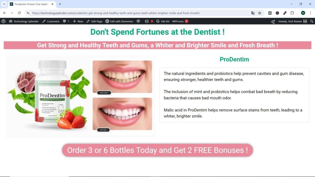
Below we show a Page created with Elementor where the main and footer menus are still displayed.
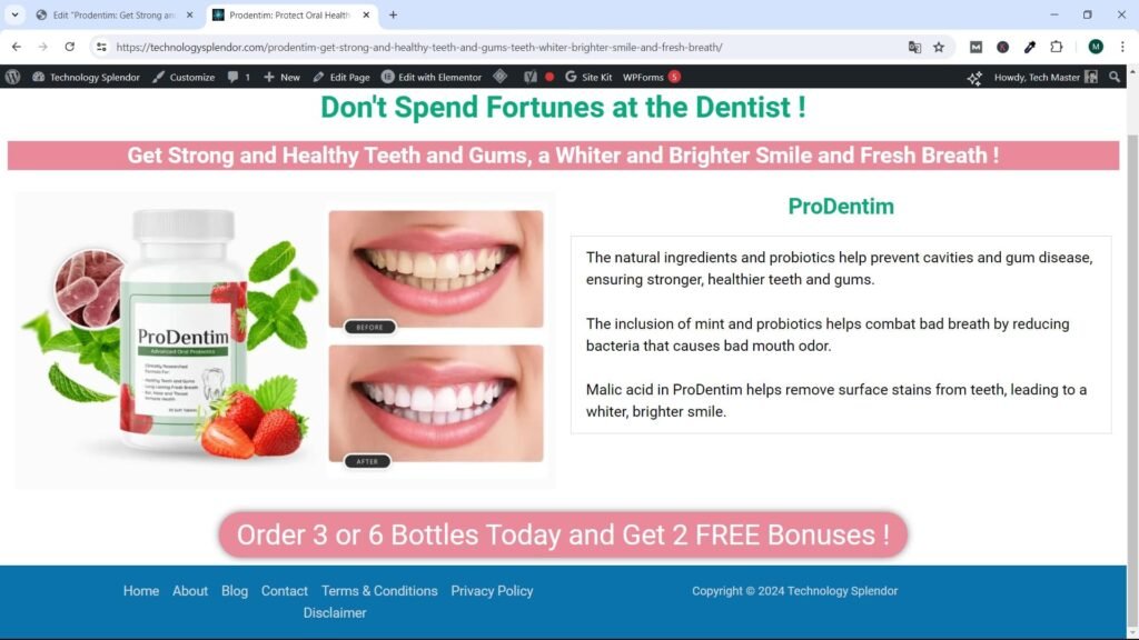
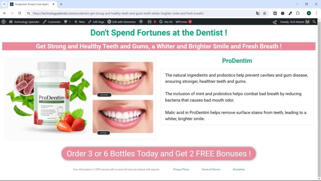
Now we show the Page without the main or footer menus, that is, the Landing Page.
We then show the Landing Page with a text where we assure the visitor that their information is safe with us and that we will not share it with anyone, followed by links to legal pages that are required by law.
And finally, we show the final point where the Call To Action button takes the visitor, the Sales Page.
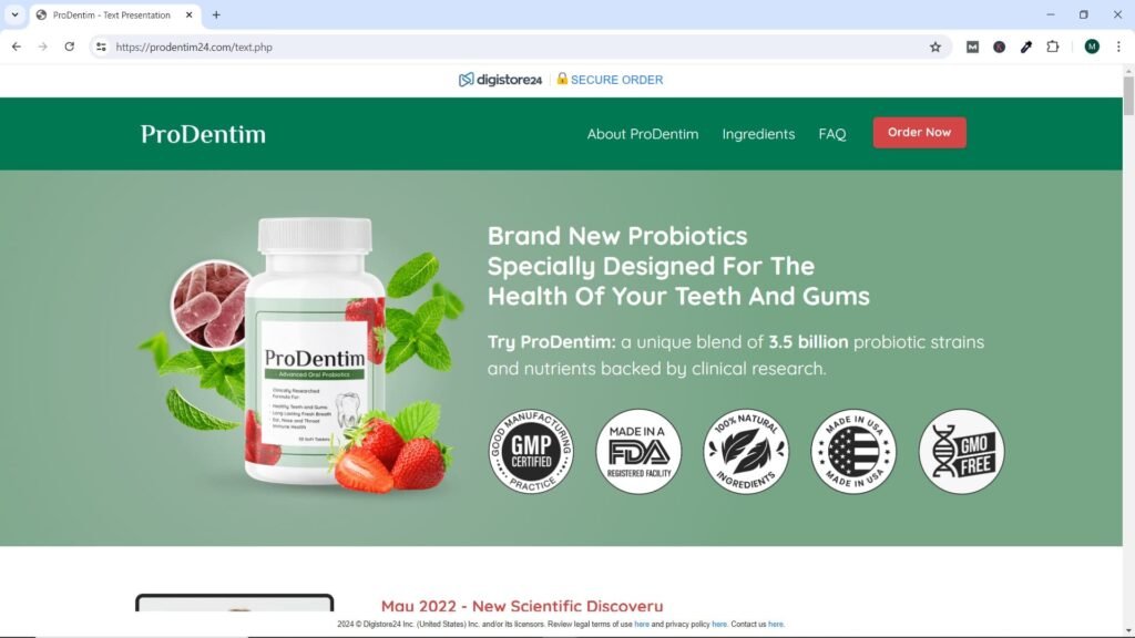
On the Sales Page, unlike the Landing Page, we can include Detailed Information about the Product or Service, Benefits, Bonuses (when they exist), free shipping (if available), Testimonials from people who have Purchased the Product and are Satisfied, frequently asked questions (FAQ), links to the Legal Pages of the Merchant and/or Manufacturer, Payment buttons, Return and Refund Guarantees.
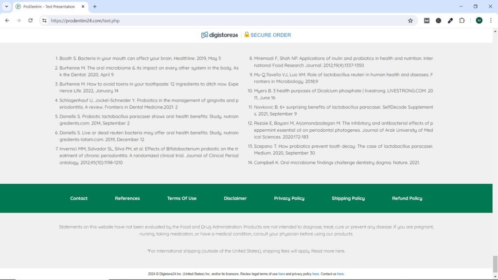
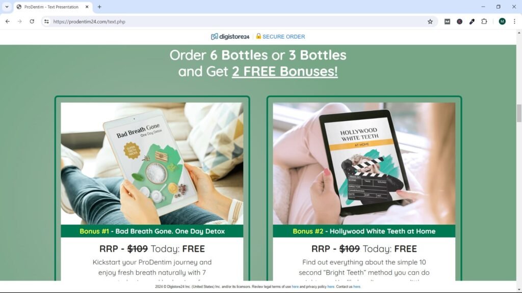
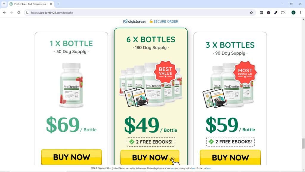
Below we show some Screenshots that show this information for the specific case that our Sample Landing Page deals with, the sale of a Dental and Oral Hygiene product.
Bonuses
Hey, who doesn’t like free stuff? We believe he is rooted in human nature. Fast forward to online marketing and you’ll discover that free bonuses are as necessary to your offers as any other element. It is not uncommon to offer several bonuses to make your offer truly irresistible.
What can you offer? Bonuses don’t necessarily have to be expensive add-ons. Many times the bonus can be an offer related to easily produced information, such as a report, e-book, video, audio, or similar digital content.
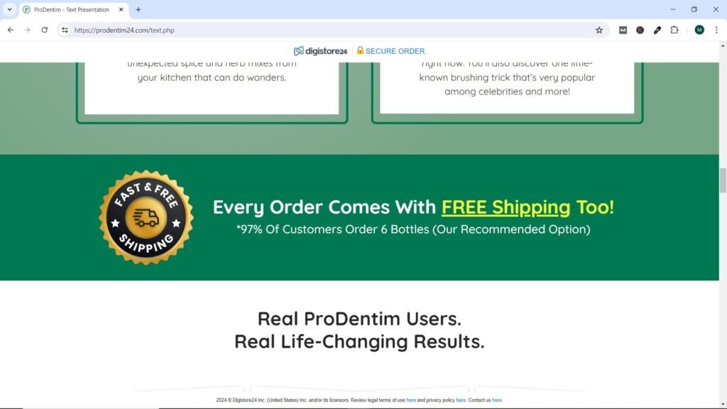
Free Shipping Benefit
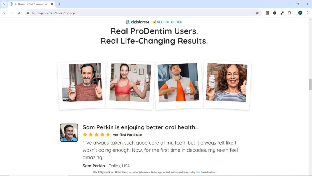
Testimonials
What can really sell the offer being presented is the affirmation of other people who have already purchased or experienced the content or product and are satisfied customers. In today’s social media-driven world, this can also be called “social proof.” With this in mind, it’s a great idea to get at least three happy people who participated in the offer and include their testimonials.
As you sell more and more products from your offering, be sure to ask your satisfied customers for testimonials. If your product or service works well, it’s usually not difficult to get testimonials. The most common responses from your clients are usually “I don’t know what to write” and questions related to privacy.
A common response is to ask a few questions about what they liked about your product/service and then write them the testimonial and get their permission to reprint it. For privacy reasons, it is also common to use only your first name and last initial, or only the initials along with a state, city, or country ID.
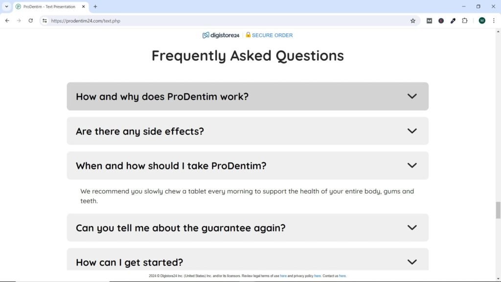
Frequently Asked Questions (FAQ)
It’s always good to anticipate any questions or concerns your prospects may have ahead of time and create a “frequently asked questions” or simply FAQ section. This is especially important if the product is expensive. Many buyers like this information because it is convenient for them and for you. Otherwise, serious buyers will email you questions, and as you receive and answer all of those questions, FAQs make a lot of sense, especially if the deal is a bit complicated or needs more justification to make a purchasing decision.
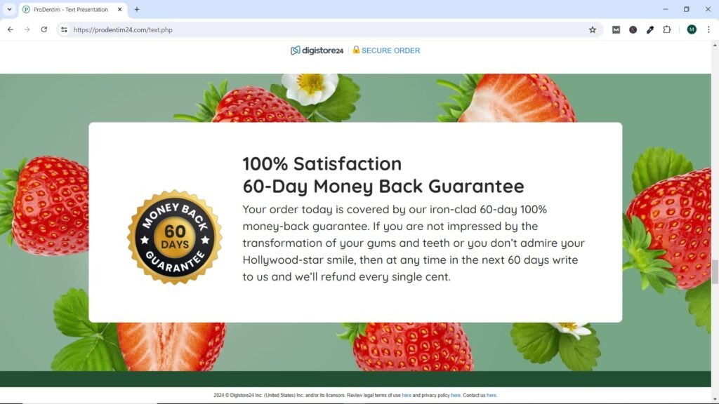
Money Back Guarantee
In this part of the sales page, you tell the reader what warranty (if any) exists for this particular offer. There is a guarantee to give the reader confidence when purchasing and also indicates that you stand behind your offer and the claims made.
Studies overwhelmingly say that a clear and strong money-back guarantee actually increases overall sales and has a very significant impact on conversions (converting visitors/readers of a sales page into buyers).
It is also highly recommended that you provide the guarantee as soon as the price is shown, which can help the potential buyer worry less about the cost of your offer, especially if it is expensive, $50 and up.
Keep in mind that a money-back guarantee is not always ironclad, and sometimes you shouldn’t offer it unconditionally. It is not a good idea to offer a money back guarantee of more than 60 days, in fact it is better to only 30 days. Surely at first sales will skyrocket, but when the money back guarantee period is too long, people tend to abuse it, in fact, encourage people to use it and simply return it (regardless of whether the program worked well or not).
Less dramatically, the money back guarantee should be carefully considered with some types of products.
Payment Buttons
Of course, when an offer is presented with a purchase decision attached, there must be a mechanism to make the purchase. That mechanism is the checkout button, which potential customers click at the time of purchase. They will then go to a separate page to finalize that transaction. For many, that means payment services like PayPal, Stripe, or a Networks like JVZoo, ClickBank , WarriorPlus or another platform that can help you make PayPal transactions or credit card purchases. Generally, the Sales Page and everything that it requires is the responsibility of the Affiliate Program or Network.
Typically, a checkout button should be presented at least twice: the first should appear in the middle of a landing page after readers have seen the title, subtitle, video (if one is included), and sales text, and just before the warranty. . The second may come later, after the testimonies and the “what’s inside” text. However, if you are selling an inexpensive item and need little sales copy, a checkout button may be enough.
If you sell a high-end product and the sales page is relatively long, the checkout button may be displayed more than once or twice. An additional consideration (if it is an expensive offer) is to give the buyer more than one way to buy, such as “You can save money by making a one-time payment of $149 or making three easy payments of $67.”
Legal Notices and Disclaimers
Remember, whether you are an affiliate or a merchant, your landing and sales page need links at the bottom that serve as legal notices as required by law. Agencies like the Federal Trade Commission require this to be your duty to your landing and sales page visitors.
It is important to include links to legal pages such as the privacy policy, terms and conditions, and disclaimer on the landing page, not just the sales page. This is because these pages provide crucial information on how personal data is handled, user rights and responsibilities, and limitations of liability respectively. Including these links on the landing page helps establish transparency and trust with visitors from the beginning, which is essential to comply with legal regulations and build credibility with your users.